Encoded Realms, Group exhibition with works by: Chan Sook Choi, Annette Cords, Katrin von Lehmann, Bettina Scholz, Hara Shin, Kang Contemporary Berlin, September 5, 2025 – November 7, 2025
News

Thomas Scheibitz/Bettina Scholz – Speicherbild/Die Form der halben Sonne, a two-day summer exhibition in the studio, as part of the Panke Open Studios in Berlin Wedding. More information here: https://uferhallen-ev.de/events/panke-open-studios/

Artist Talk: Bettina Scholz im Gespräch mit Julia Voss (German with English subtitles), Kunstverein Heilbronn, 2025
New book out now: Bettina Scholz – Ost/West und das Südliche Orakel. Monograph Kunstverein Heilbronn, Edited by Max Dax and Matthia Löbke, Text (German/English) by Bettina Scholz, foreword by Max Dax and Matthia Löbke, 160 p. with 120 colour images, Format 29.7 x 23 cm, paperback, ISBN 978-3-86442-445-8, https://snoeck.de/shop/bettina-scholz-ost-west-und-das-suedliche-orakel/


Texts, Talks, Projects

Bettina Scholz und Laura Sachs im Interview mit Jan Kage zur Ausstellung im Schau Fenster
„It’s precisely the visceral immateriality of music that escapes the scope and authority of predicative language and semiotics. Berlin-based painter Bettina Scholz translates this immateriality in her dystopic triptych, individually titled “Blade Runner 2049,” “Qualm,” and “Solaris.” Taking inspiration from Benjamin Wallfisch and Hans Zimmer’s Blade Runner 2049 film score and Helena Hauff’s gritty, acid-soaked album Qualm, Scholz’s synesthetic process forms subliminally, resulting in raucous and even gothic abstractions in her acrylic glass paintings. Referencing this synesthesia, Scholz comments, “When I hear music, I see colors in my mind.”
https://www.electronicbeats.net/black-album-white-cube-exhibition/
Auf meinem iPhone habe ich als Screensaver ein Bild des Südquerhausfensters aus dem Kölner Dom von Gerhard Richter. Und du?
Mein eigenes Bild.
Also ein Glasbild.
Genau. Das Material Glas — oder Acrylglas — haben wir täglich um uns: als Screens, Tablet-Oberflächen, aber auch in der Architektur. Es ist zugleich alt und traditionsreich, als auch neu. In meinen Bildern ermöglicht es mir, starke visuelle Reize zu entwickeln. Manchmal sind es ästhetische Übertreibungen, manchmal eine besondere Form der Intensität. Ich kann schwer beschreiben, woraus sich ein Bild oder Objekt letztendlich entwickelt.
Gerhard Richter verbaute in Köln über 11.000 Glasquadrate in 72 Farben. Eine davon ist das Orange, das eine Reihe deiner geradezu leuchtenden Glasbilder dominiert. Das Orange ist dabei so stark, dass ich dich frage: Was hat es mit dieser Farbe auf sich?
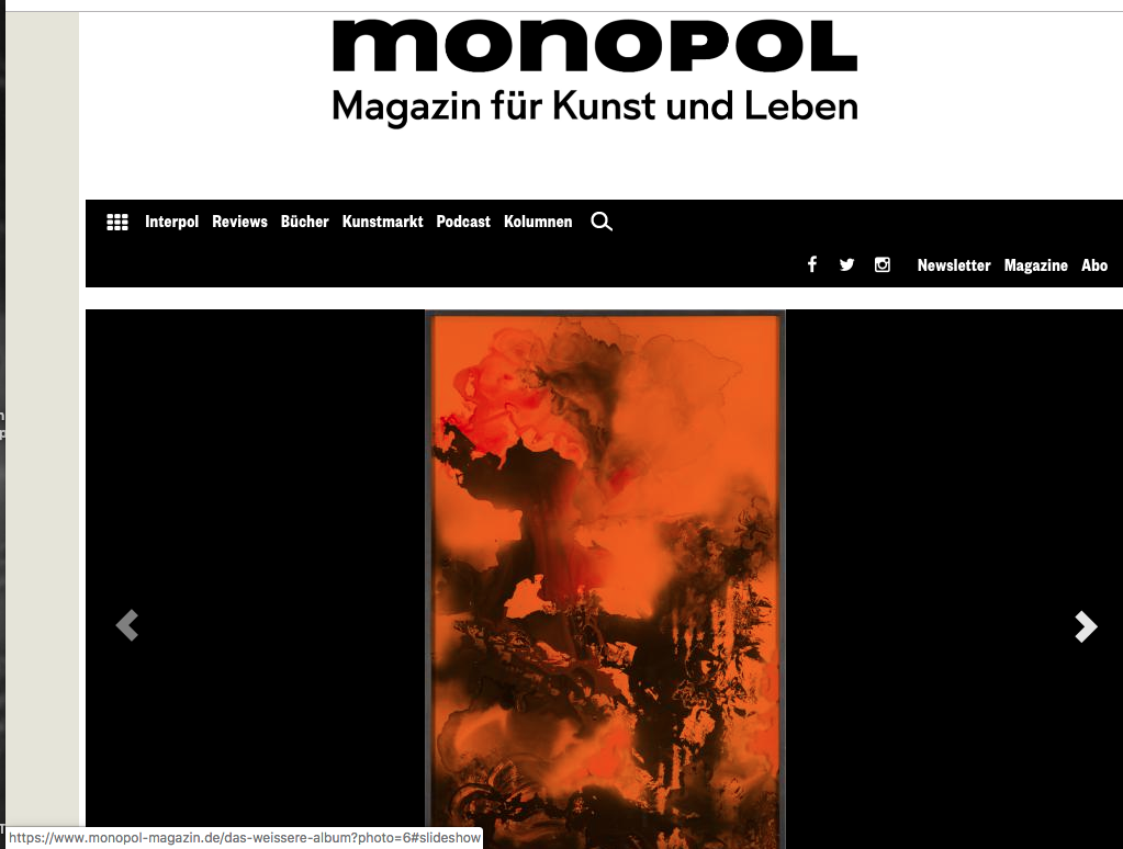
Orange ist eine sehr ambivalente Farbe. Einerseits ist sie eine Warnfarbe, die Farbe des Katastrophenschutzes, aber in der Psychologie gilt sie als stimmungsaufhellend oder bei den Buddhisten als die Farbe der höchsten Erleuchtung. In dem Film Blade Runner 2049 liegt ein schmutzig-orangener Filter über dem ruinösen Las Vegas und zeigt eine entrückte, kontaminierte Landschaft. Orange hat negative wie positive Bedeutungen. Ich bin fasziniert von seiner Dominanz. Ich schwäche die Farbe nicht ab, sondern verstärke sie. Hier in der Santa Lucia Galerie wird sie noch einmal verstärkt, dadurch dass wir die Wand blau gestrichen haben.
Wie erreichst du diese leuchtende Intensität?
Ich benutze oft Farbfilter im Glas. Also stärker oder schwächer eingefärbte Gläser, je nach Bild. Dadurch muss ich dann gegen diese Tönung anmalen, alle Farben darunter und darauf verstärken und übersteigern. Jedes Bild hat in dieser Serie seine spezifische Tönung — Orange, Blau, Dunkelrot.
Du malst also mit gefiltertem Blick?
Sagen wir mal so: Diese Filter helfen mir, eine bestimmte Atmosphäre zu kreieren, eine Entrücktheit und Transzendenz herzustellen, ähnlich wie bei dem frühen Experimentalfilm Rose Hobart von Joseph Cornell, wo er alles durch einen bläulichen Filter filmte. Mir geht es dabei um Verdichtung, andererseits aber auch um eine fast manieristische Übertreibung. Wir kennen Filter eher aus der Fotografie, etwa aus den sozialen Medien, als aus der Malerei. Durch den Orangefilter bei Blade Runner 2049 bekommen die im zerstörten Las Vegas gedrehten Szenen etwas Post-Apokalyptisches, etwas Unwirklich-Entrücktes. Wenn man nicht ahnte oder wüsste, dass dort eine nukleare Katastrophe stattgefunden hat — man könnte die Szenerie geradezu als schön bezeichnen.
Beobachter der ersten Atombombentests in Nevada sprachen genau davon: Die Explosionen seien das Schönste gewesen, was sie je im Leben gesehen hätten.
Diese große Ambivalenz zwischen Schönheit und Bedrohung, zwischen romantischer Leuchtkraft und totaler Zerstörung interessiert mich. Alles ist ganz Oberfläche und geht zugleich tiefer.
Orange oder kupferfarben ist auch die Droge Magnon, welche die Protagonisten in Leif Randts Roman Planet Magnon zu sich nehmen. Du hast eine Bilderserie explizit Magnon betitelt.
Planet Magnon ist ein großartiger, neuer Zukunftsroman! Nur ein Bild heißt bei mir explizit Magnon, aber weitere Bilder knüpfen daran an. Sie sind parallel beim Lesen des Romans entstanden und ich denke, dass sie also auch mit ihm zu tun haben — allerdings auf einer rein intuitiven Ebene. Es gibt keine direkten Übersetzungen des Textes in Bilder. Der Roman hat mich berührt, und alles, was mich wirklich berührt, beginnt mich zu interessieren. Ich bin überzeugt, dass es dadurch auch in meine Arbeit einfließt. In dem Buch gibt es einen interessanten, oft nur kurz und situativ auftretenden Umgang mit Farbe. Es werden dann ganz beiläufig der „kernblaue Himmel“ oder „Kupferfelsen“ genannt. Es gibt auch den Mond „Pink“. Die Verwendung von Farbe als Stilmittel schafft in dem Buch sofort und mit wenig Aufwand imaginäre Bilder.
Wie stellst du dir Magnon vor?
So ähnlich wie mein Bild aus dem Jahr 2016. Magnon ist eine Substanz, die in Kollektiven genommen wird — aber nicht, um Orgien zu feiern und um sich zu berauschen, sondern im Gegenteil, um durchlässiger zu werden, um dazuzulernen. Es handelt sich um eine horizonterweiternde Substanz, mit der man bessere Gespräche führen kann und größere Erkenntnis erfährt. Man muss für meine Bilder aber nicht den Roman kennen, um sie zu verstehen. Meine Bilder spielen im Kern mit der Idee von schillernder Verführung und der Sehnsucht nach Veränderung, die man auch ohne das Buch wahrnehmen kann.
Du hast mit Blade Runner 2049 und Planet Magnon zwei explizite Beispiele aus der Popkultur genannt, weist aber von dir, dass deine Bilder die genannten Quellen direkt illustrieren.
Ich würde Filme, Romane, Musik oder auch Gespräche nicht als Quellen bezeichnen wollen, sondern vielmehr als Wahlverwandtschaften. Eine Quelle ist ja immer zuerst da — und dann geht es weiter. Es gibt aber auch Fälle, dass ich Jahre, nachdem ich ein Bild gemalt habe, einen Song höre und ihn mit diesem Bild rückwirkend assoziativ verknüpfe. Dieser Prozess ist vielleicht vergleichbar mit dem freien Assoziieren in der Psychoanalyse. Viele meiner Bilder kommen ja aus dem Farbfleck oder sind wie eine Art hingeworfene Schrift. Malerei ist für mich nicht zeitlich linear, sondern sie bewegt sich in mehreren Zeitebenen und -zusammenhängen. Gerade weil ein Bild keine solche Linearität hat, gibt es die Möglichkeit, sich ihm immer neu, mit sprunghaften Ideen und auf verschlungenen Pfaden zu nähern. Mein ideales Publikum tut dies und bildet seine eigenen Wahlverwandtschaften zu den Bildern. Erst kürzlich besuchte mich eine Kunsthistorikerin, die ihren Schwerpunkt auf der Kunst bis zum 17. Jahrhundert hat. Sie hat meine Arbeiten sehr sakral gesehen und mit Andachtsbildern assoziiert. Eine Woche später besuchte mich ein Sammler, der mir wirkungsmächtige Drone-Musik vorspielte, als er meine Bilder im Original sah. Beides ist für mich nachvollziehbar. Mich interessiert das Alte genauso wie das ganz Neue, die Kunst der Gotik ebenso wie der Blade Runner. Und ich kann viele Verbindungen herstellen.
Das spiegelt sich ja in den Verweisen auf für dich relevante Kontexte in diesem Katalog, die von Filmbeispielen über sakrale Kunst bis hin zu bildhaften Strukturen reichen, wie sie in Fotografien von Naturkatastrophen vorkommen.
Wir beide haben ja den NASA-Account auf Instagram abonniert. Deren Fotografien ferner Galaxien gehören auch in den Atlas der Kontexte. Die NASA verstärkt und übersteigert die Farben ihrer Weltraumbilder übrigens ebenfalls sehr oft mit Filtern.
Die NASA-Bilder zeigen die Perspektive auf den endlosen Weltraum. Wenn man mit dem Mikroskop eintaucht in die Mikrowelten der Zellen und Atome, dann bekommen wir Strukturen zu sehen, die den Weltraumbildern nicht unähnlich sind.
An solchen sichtbaren Strukturen aus der Natur wie auch jenen, die erst durch neue Technologie sichtbar gemacht werden, bin ich sehr interessiert. Ob nun ein Sandsturm aufwirbelt oder ein Tornado Wolken und Landschaft aufzusaugen scheint. Am Ende geht es immer um die Frage: Was interessiert mich wirklich? Erst, wenn mich etwas wirklich berührt, kann ich es als Material an mich heranlassen und vielleicht benutzen. Ich glaube, das ist sehr menschlich. Auch du hast dich erst wirklich für meine Arbeit zu interessieren begonnen, nachdem dich ein Bild in meinem Atelier sehr getroffen — also berührt hat.
Ich erinnere mich genau: Das war dein — abermals orangefarbenes — Bild Fire and Ice, und ich konnte meinen Blick nicht abwenden.
Das ist ein nicht-rationaler Vorgang und auch schwer zu versprachlichen. Ich versuche bei der Arbeit immer einen größtmöglichen Jetzt-Moment zu schaffen, um auf diese Emotionen und Interessen zu stoßen. Ich reagiere beispielsweise sehr empfindlich auf die Frage: „Was machst du heute im Atelier?“ Da kann ich regelrecht schlechte Laune bekommen. Ein Teil meines Arbeitsprozesses besteht darin, genau dies vorher nicht zu wissen. Ich suche die Gegenwart des Jetzt im Malprozess – es ermöglicht mir, alle Einflüsse zuzulassen.
Zwischen den von dir genannten Kontexten wie Gotik und Blade Runner liegen Jahrhunderte.
Für mich sind alle Zeiten in die Malerei eingeschrieben, da sie neben der Zeichnung zu den ersten bildproduzierenden Medien der Menschheit gehört. Mit dieser Fülle kann ich nur umgehen, wenn ich möglichst situativ arbeite und von dort aus Zeitsprünge mache.
Deine Zeitsprünge sind nichts anderes als imaginierte Zeitreisen, die dich in die Zukunft und in die Vergangenheit führen. Alexander Kluge hat eine ähnliche Vorstellung von Zeitreisen. Kluge sagt, dass die Welt der Kunst wie eine Kugel sei: Alles zusammen hat eine Kugelgestalt mit der gleichen Schwerkraft wie die Erde, welche die Oberfläche zusammenhält. Alle Künste berühren sich dank dieser Kugelgestalt, und die Künstler merken intuitiv, an welche Strömung der Vergangenheit sie andocken können, wo sie die Kunst oder die Musik neu starten können. Er zieht daraus den Schluss, dass der Bass des Techno beispielsweise anknüpft an die Idee des hypnotischen Basso Ostinato in der Barockmusik.
Dieser Gedanke entspricht mir absolut! Er scheint tatsächlich an das anzuknüpfen, was ich eben versucht habe zu erklären. Intuition ist ein wichtiges Stichwort, der Zufall aber auch. Ich sehe sie mittlerweile als ganz präzise Werkzeuge.
Du bist zuversichtlich, was den Zufall betrifft. Hast du erst einmal eine Art Vokabular für eine Bilderserie gefunden, dann ist auch stets klar, was geht — und was nicht?
Ja, aber diese Klarheit muss ich erst schaffen und es ist eine andere Form der Klarheit, als wir sie im Alltäglichen definieren würden. Dadurch, dass ich viel mit Farbschüttungen arbeite und mit gefundenen Materialien, kann ich das Ergebnis nie bis zum letzten Punkt wirklich kontrollieren und will das auch gar nicht. Aber es gibt doch Themen, die immer wieder auftauchen. Ich denke, vieles, was ich bisher gemacht habe, handelt letztendlich von der bereits erwähnten Koexistenz von Schönheit und Bedrohung: Ein Gewitter ist schön, aber auch bedrohlich. Das Meer steht sinnbildlich für Größe und Freiheit, kann aber auch Entwurzelung und Tod bedeuten, nicht nur bezogen auf die aktuelle, dramatische Situation vieler Geflüchteten, sondern auch auf die Naturgewalten. Liebe ist schön, aber schließt auch immer die Bedrohung des Verlassenwerdens, der Endlichkeit mit ein. Es ist sehr schön, die Chance zu haben, sich von jemandem zu verabschieden, der stirbt, und natürlich ist es gleichzeitig unglaublich traurig und bedrohlich für die eigene Existenz.
Zusammengehalten wird Alexander Kluges Kugel der Künste durch ihre eigene Schwerkraft. Deine Bilder werden zusammengehalten durch die glatte Oberfläche des Glases und den Rahmen.
Der Rahmen ist Teil des Bildes oder Objektes. Er wird im Allgemeinen als Grenze zum Raum wahrgenommen. Ich sehe ihn indes mehr als Fassung, die etwas visuell greifbar macht, was sonst sehr schnell verschwinden würde. In ihrem Inneren haben viele dieser Bilder ja auch oft etwas Flüchtiges. Sie zeigen meist Übergangssituationen, Veränderungsprozesse, nichts Statisches. Ich empfinde ein gerahmtes Bild auch nicht als begrenzt. Es ist ein anderer Ort, inmitten vieler möglicher Orte.
Bei anderen gerahmten Bildern könnte man sagen: Hinter dem Glas liegt das Bild. Du durchbrichst das. Teilweise ist das Glas selbst von innen bemalt, teilweise ist das dahinterliegende Bild durch Farbauftrag fast schon dreidimensional-skulptural. Das Glas wird also zum Teil des Bildes, das damit zur Vitrine, zum Objekt wird, und somit zur Skulptur.
Ja, wenn man sie als Objekte betrachtet, könnte man einige auch als Dioramen oder Vitrinen bezeichnen. Hinter den Gläsern, in den Schichtungen und Spiegelungen, wird aber auch viel Dunkelheit, manchmal Chaos sichtbar. Das Publikum assoziiert sie oft mit Landschaften, die zwischen Dystopie und Utopie schwanken. Diese Serie hat sich im Laufe der Zeit stark verändert. Ich habe mit einem eher dunklen, monochromen Farbraum angefangen, dessen Stimmung mich rückblickend manchmal an Filme von Lars von Trier erinnert. Sie entwickeln sich jetzt in etwas viel Leuchtenderes, von dem ich noch nicht weiß, wo es mich hinführt, und ob es ein Ende dieser Serie geben wird. Zur Zeit sind sie verlockend „shiny“.
Von welchen Filmen Lars von Triers sprichst du?
Insgesamt hat mich Lars von Trier definitiv geprägt, auch die älteren Filme. Von den jüngeren finde ich Melancholia großartig, im wahrsten Sinne des Wortes: In seinem Drama, in seiner flirrenden Aura, in diesem Überwältigungsmodus. Bei Melancholia begeistern mich die phantastischen Bilder, zum Beispiel die zwei Monde über dem Park. Alles vibriert vor Irrsinn und Dekadenz.
Neil Tennant sagt: „Pop ist Oberfläche.“ Deshalb muss Pop strahlen.
Bei Tennant ist das positiv besetzt, wie so oft im Pop. Der Kulturwissenschaftler Byung-Chul Han kritisiert die glänzende, glatte Oberfläche hingegen heftig: „Das Glatte ist die Signatur unserer Gegenwart“ ist der erste Satz seines Buches Die Errettung des Schönen, und er meint das nicht als Auszeichnung. Neulich hatte ich eine Besucherin aus London in meinem Atelier, und obwohl wir uns noch kaum kannten, hat sie sich vor einem der Acrylbilder erst einmal ganz lange die Haare gerichtet — weil es so spiegelt. Sicher hat die spiegelnde, glatte Oberfläche diese narzisstische Anziehungskraft. Das ist mir bewusst und ein Teil des Gedankenraums dieser Bilder.
Wie wichtig ist es für dich, dass du dich im Atelier wegschließen kannst? Welche Bedeutung hat der Atelierraum für dich? Trittst du dann aus der einen Welt heraus und begibst dich in eine andere?
Tatsächlich sind Ruhe und Abgrenzung wichtig für mich. Am besten ist es, im Atelier eine Art Utopia zu kreieren, einen Raum mit größtmöglicher Freiheit. Das ist auch ein Ort, an dem ich keine Verpflichtungen, keine Termine, keine Geldsorgen habe. Und nur sehr gezielt Internet und Telefon benutze. Der ideale Atelierzustand ist einer, wo ich ungestört über mir wesentlich erscheinende, auch existentielle Dinge nachdenken kann. Es ist wichtig für mich, diese Voraussetzungen zu schaffen, um in einen guten Arbeitsprozess zu kommen. Bei der Malerei sind konkrete Ideen für mich eher Bremsen, die können sogar regelrecht Blockaden in mir hervorrufen. Also versuche ich systematisch in einen Zustand hineinzukommen, der ein freies Assoziieren ermöglicht. Dann komme ich auf die Spur und finde fast wie von selbst, was ich brauche. Ich habe in den letzten Jahren aber auch immer wieder Projekte realisiert, bei denen ich das Atelier verlasse und viel konzeptioneller arbeiten musste. Für die Kunsthalle Exnergasse in Wien habe ich 2016 mit zwei Freundinnen und Kolleginnen das Ausstellungskonzept Antenna Futura entworfen und kuratiert, und mit einer befreundeten Autorin aus Amsterdam habe ich an einem Projekt gearbeitet, das Bild, Sprache und Poesie verbindet. Diese Arbeiten katapultieren mich aus dem Atelier Utopia heraus und erfordern viel Kommunikation und den Umgang mit ganz konkreten Lösungen und Ideen. Dagegen widersetzt sich meine Malerei. Für sie muss ich, wie Michael Ende es beschreibt „in eine andere Logik springen“.
In eine Logik der Kindheit?
Mag sein, meine Erinnerung daran ist vage. Jedenfalls ist es eine andere als unsere Alltagslogik, die ja sehr geprägt ist von dem Prinzip Plan und Ausführung. Allerdings spielt meine Kindheit sicher eine große Rolle in Hinblick auf mein starkes Empfinden für diese in meinen Bildern thematisierte Koexistenz von Schönheit und Bedrohung. Ich bin in einer Aussteigerfamilie in der DDR groß geworden. Meine Eltern waren Anthroposophen, die eine Pension an einem See führten, wo wir auch wohnten. Das war absolut nicht konform mit der gängigen Ideologie und gefährlich. Die Grundstimmung meiner Kindheit bewegte sich zwischen Idyll und Gefahr, vielleicht ist das eine Quelle. Meine Mutter war sehr literaturbegeistert und hat uns oft illegal Bücher aus dem Westen besorgt…
Was für illegale Bücher waren das?
Ich war noch Kind, das waren Kinderbücher.
Verbotene Kinderbücher?!
Sagen wir: nicht gern gesehen. Michael Endes Momo war eine Zeitlang tatsächlich verboten. Was seltsam ist, da man es ja klar kapitalismuskritisch lesen kann. Selma Lagerlöf wurde ebenfalls kritisch gesehen, auch Lewis Carroll oder Astrid Lindgren: Pippi Langstrumpf ist immerhin so etwas wie eine gutsituierte Anarchistin, finanziert durch einen Koffer voller Goldstücke – das passte sicher nicht in die vorherrschende Ideologie. Ich musste die Bücher verstecken, wenn bestimmte Leute uns besuchen kamen, und ich durfte bestimmte Sachen in der Schule nicht sagen. Diese Bücher hatten eine Brisanz und waren für mich umso attraktiver. Das hat sicher auch dieses Gefühl in mir verstärkt, dass die Kunst, die Literatur und die Fiktion eine subversive Kraft haben. Sie können eine gesellschaftsrelevante Kraft entwickeln, weil sie sich über einen Ist-Zustand hinwegsetzen.
Wie alt warst du, als 1989 als die Mauer fiel?
Zehn.
Welche Bücher wurden dann nach dem Mauerfall zu deinen Begleitern?
Ich lese sehr viel und es ist schwer etwas besonders hervorzuheben. Zurzeit lese ich Imperium von Christian Kracht. Das Buch erzählt eine Geschichte aus der Reform- und Ökobewegung zu Anfang des 20. Jahrhunderts. Der Protagonist, den es wirklich gegeben hat, kauft eine Insel und beschließt, nur noch von Kokosnüssen zu leben. Sowohl die Sprache als auch die Geschichte haben etwas Altmodisch-Manieristisches und zugleich etwas total Zeitgemäßes. Die Geschichte hat mich sicher auch deshalb so berührt, weil sie eben von einer Aussteigerszene erzählt und deren Anliegen jetzt zum Mainstream gehören.
Wundert es dich, dass nicht wenige Betrachter deiner Gemälde in ihnen Abbilder der Apokalypse zu erkennen meinen?
Nein, es gibt ja in vielen ein großes Drama und auch eine Erschütterung.
Man meint in deinen Abstraktionen oft Figuratives zu erkennen. Das Fraktale der Katastrophe wird konkret — und sei es nur im Kopf des Betrachters.
Möglich, wir suchen immer nach einem Sinn und in Bildern immer nach einer Erinnerung — an etwas, das wir kennen und mit dem wir es verknüpfen können.
Jeder Maler steht vor einer Traditionslinie, die in der Höhlenmalerei beginnt, über Goya und Picasso führt und bei Frankenthaler und Lassnig noch lange nicht endet. Wie stehst du als Malerin im Jahr 2018 zu dieser Geschichte, dieser Tradition und dieser Ahnenfolge? Auch wenn die Materialien in deiner Glas-Serie von der traditionellen Leinwandmalerei abweichen, positionierst du dich ja trotzdem gegenüber dieser Tradition.
Ich habe keine Berührungsängste. Es gibt ja verschiedene Herangehensweisen des Bekämpfens, des Wegstoßens und des Zerstörens — aber auch des Umarmens, des Heranlassens und des Aufgreifens. Ich möchte alles benutzen dürfen. Ich sehe noch etliche interessante mögliche Variationen in den von mir begonnenen Serien, so dass hier noch viele Bilder entstehen können. Zunehmend wichtig wird auch die Dimension der Musik — als weiteren Kontext neben dem Film, der Natur und der Literatur.
Wie hat man sich das Immaterielle der Musik in deiner Malerei vorzustellen?
Ausgangspunkt sind hier die Tonspuren bzw. Scores zu ausgewählten Science-Fiction-Filmen, die mich nicht loslassen, sich als Geistermelodien in meinem Kopf festgesetzt haben. Das sind die Filmmusiken etwa von Edward Artemiev zu Solaris von Andrej Tarkowskij, aber auch die Scores von Vangelis und Hans Zimmer, die zu den beiden Blade-Runner-Filmen die Musik geschrieben haben. Fasziniert bin ich von den Soundtracks zu den klassischen Star-Wars-Filmen. Hier hat der Komponist John Williams das Prinzip der Leitmotive bei Richard Wagner abgekupfert und auf seine Protagonisten übertragen — von der imperialen Einschüchterungsmusik im Falle Darth Vaders über die euphorisch- idealistische Musik bei Luke Skywalker bis zur romantischen Märchenmusik bei Prinzessin Leia. Momentan höre ich auch oft den wunderbar sphärischen Soundtrack zu Ghost in the Shell im Atelier, und ich denke, er fließt gerade in neue Arbeiten ein. Fast automatisch bieten sich hier Farb- und Formenwelten an.
Carsten Nicolai aka Alva Noto komponierte sich zu Solaris sogar seinen eigenen elektronischen Score.
Auf alle Fälle ist die Musik ein ganz neues und doch zugleich sehr vertrautes Feld, das mich anzieht. Man kann Musik nicht illustrieren — das finde ich extrem verheißungsvoll. Sie geht direkt in Herz und man braucht zunächst keine Sprache, um sie zu verstehen. Ich kann mir also eine Malerei, die versucht, ihre Emotionalität in Bilder zu übersetzen, sehr gut vorstellen. Die Immaterialität der Musik erlaubt es, situativ und intuitiv zu arbeiten — und das sind zugleich die Grundpfeiler meiner Art zu malen. ~
Bettina, the screensaver image on my iPhone is of the south transept window in Cologne Cathedral by Gerhard Richter. What do you have as a screensaver?
One of my own paintings.
So it’s a glass picture.
Exactly. The material of glass or acrylic glass is around us every day, as screens, tablet surfaces, but also in architecture. It is both old and traditional, as well as new. In my pictures it allows me to develop strong visual stimuli. Sometimes it is aesthetic exaggeration, sometimes it’s a special form of intensity that I can hardly describe, from which an image or object ultimately develops.
In Cologne, Gerhard Richter installed more than 11,000 glass squares in 72 colors. One of them is the color orange, which defines a series of your almost glowing glass pictures. The orange is so dominant in some of your glass pictures that I have to ask: What is it about this color?
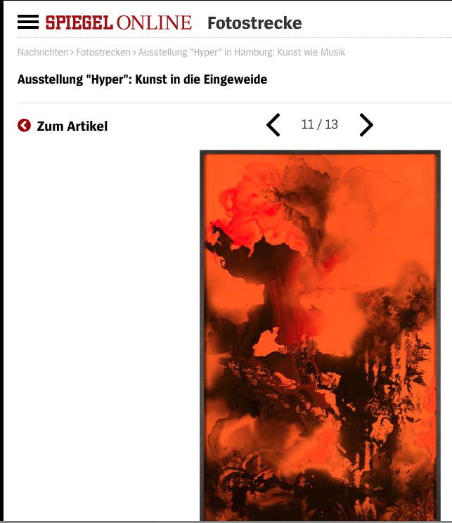
Orange is a very ambivalent color. On the one hand, it is a warning color, the color of the Civil Protection Service, but in psychology it is considered mood-enhancing or, in the case of Buddhists, the color of the highest enlightenment. In the film Blade Runner 2049, a dirty orange filter lies over the ruins of Las Vegas and shows a remote, contaminated landscape. Orange has both negative and positive meanings. I’m fascinated by its dominance. I do not weaken the color, but rather enhance it. Here in the Santa Lucia Gallery it is reinforced even more, because we have painted the wall blue.
How do you achieve this luminous intensity?
I often use color filters in the glass. So stronger or weaker colored glasses, depending on the picture. As a result, I have to paint against this tint, so to speak, by intensifying and exaggerating all the colors beneath it and above it. Each image in this series has its specific tint: orange, blue, dark red.
So you paint with a filtered view?
Let’s put it this way: these filters help me to create a certain atmosphere, to create a sense of detachment and transcendence. It’s similar to Joseph Cornell’s early experimental film Rose Hobart, where everything was filmed through a bluish filter, for example. On the one hand, I am concerned with density, on the other with an almost mannerist exaggeration. We know the filter method more from film and photography than from in painting. Not least due to the orange filter on Blade Runner 2049, the scenes shot in the destroyed Las Vegas attain something post- apocalyptic, something unreally detached. If one didn’t suspect or know that there had been a nuclear catastrophe there, one could even describe the scenery as beautiful.
Observers of the first atomic bomb tests in Nevada reported that the explosions had been the most beautiful things they have ever seen in their lives.
I am interested in that ambivalence between beauty and danger, between romantic luminosity and destruction. Everything is completely on the surface and at the same time deeper.
Orange to copper-hewed is also the color of the drug Magnon, which is taken by the protagonists in Leif Randt’s novel Planet Magnon. You have titled a painting Magnon.
Planet Magnon is a great new science fiction novel! Only one picture is explicitly entitled Magnon, but more pictures are linked to it. They materialized while reading the novel, and I think they also have something to do with it – on a purely intuitive level. There are no direct translations of the text into paintings. The novel touched me, and everything that really touches me starts to interest me. I am convinced that it also flows into my work. In the book there is an interesting, often only brief and situational approach to color. For example, the “core-blue sky” or “copper cliffs” are casually mentioned. There is also a moon called “Pink”. The use of color as a stylistic device in the book immediately and effortlessly creates fantastic images.
How you imagine Magnon?
Just like in my painting from 2016. Magnon is a substance that is taken in collectives — but not to celebrate orgies and to get intoxicated, but on the contrary, to become more permeable, to enhance learning. It is a horizon-expanding substance with which you can have better conversations and experience greater knowledge. You do not necessarily have to know the novel in order to understand my pictures. They basically play with the idea of dazzling seduction and the longing for change, which can also be perceived without knowing the book.
With Blade Runner 2049 and Planet Magnon you mention two explicit pop-cultural examples, but suggest that your images don not directly illustrate the sources mentioned above.
I wouldn’t describe films, novels, music or conversations as sources, but rather as selected affinities. A source is always there first and then things continue. But it can also be, for example, that years after I have painted a picture, I hear a song and connect it with this image purely associatively. This process may be akin to free association in psychoanalysis. Many of my paintings come from Tachisme or look like a kind of dashed-off font that seems to come from coincidence. Painting is not temporally linear for me, but simultaneously moves in several times and contexts. Precisely because a picture does not have a chronologically linear sequence, there is the possibility to approach again and again, with erratic ideas and on winding paths. My ideal audience does this and selects its own affinity to the images. Only recently I had a visit from an art historian who focuses on art up to the 17th century. She saw my work as being very sacral and associated it with devotional images. A week later, a collector came to see me, who played powerful drone music for me when he viewed my paintings in the studio. Both are understandable for me. I’m interested in the old as well as the new, Gothic art as well as Blade Runner. And I can make many connections.
This is reflected in the references to relevant contexts in this catalog, ranging from film examples to sacral art to pictorial structures as they occur in photographs of natural disasters.
We both subscribe to the NASA account on Instagram. Their photographs of distant galaxies also belong in this atlas of contexts. By the way: NASA also often intensifies and exaggerates the colors of its space images.
These NASA images show the perspective of endless space. But if you take a microscope and immerse yourself in the micro-worlds of cells and atoms, then we again see structures that remind us of such space images.
I am very interested in such structures in nature and those that are made visible through new technology. Whether a sandstorm stirs up or a tornado seems to swallow up clouds and scenery. In the end, it always leads to the question: what really interests me? It’s only when something really touches me than I let it in as a material and maybe use it. I think that is very human. It was like that for you, too: You started to become interested in my work when a picture in my studio really grabbed you – and moved you.
I clearly remember that moment: I was gazing at your — orange-colored — painting Fire and Ice that must have put me under a spell.
This is a non-rational process, so it’s difficult to verbalize. While working, I always try to create the greatest possible moment of nowness in order to encounter these emotions and interests. For that very same reason, I react very sensitively to the question:
“What are you going to do in the studio today?” That question can really put me in a bad mood. Part of my work process is precisely about not knowing that in advance. I seek the presence of the now in the painting process – it enables me to accept all influences.
With the contexts you mentioned, such as Gothic and Blade Runner, there are centuries lying between them.
For me, all times are inscribed in painting. Alongside drawing, it is one of the first image-producing media of humanity. I can only handle such abundance if I work as situationally as possible and make time jumps from there.
Your leaps in time are none other than imaginary travels through time, back into history and forward into an imagined future. Alexander Kluge has a similar idea of time travel. Kluge says that the world of art is like a sphere: Everything together has a spherical shape with the same gravity as the earth, which holds the surface together. All of the arts are in contact with each other thanks to this spherical shape, and artists intuitively recognize which movements of the past they can dock onto, where they can start anew with art or music. He concludes that the bass of techno is linked to the idea of the hypnotic basso ostinato in baroque music.
I can absolutely relate to that idea! He really seems to be referring to what I was just trying to explain. Intuition is an important keyword, but so is coincidence. In the meantime, I see both as very precise tools.
So you’re confident when it comes to coincidence. Once you have found a kind of vocabulary for a series of pictures, is it always clear what will work — and what won’t?
Yes, but first I have to create that clarity, and it is a different kind of clarity from the way we would define it in everyday life. The fact that I work a lot with paint-pouring or with found materials means that I can never really control everything up to the final result – and I don’t even want to. But there are themes that keep recurring. I think much of what I’ve done so far is ultimately about the coexistence of beauty and threat. A thunderstorm is beautiful, but also threatening. The sea is emblematic of immensity and freedom, but it can also mean displacement and death, not only in relation to the current, dramatic situation for many refugees, but also to the forces of nature. Love is beautiful, but it always includes the threat of abandonment, of being finite. It is very beautiful to have the chance to say goodbye to someone who is dying and, of course, it is also incredibly sad and threatening to one’s own sense of existence.
Alexander Kluge’s ball of the arts is held together by its own gravity. Your paintings are held together by the smooth, polished surface of the glass and the frame.
The frame is part of the picture or object. In general, a frame is usually perceived as a border to the room. I see it more as a container that makes something visually tangible, which would otherwise disappear very quickly. Internally, many of these pictures often have something fleeting. They usually show transitional situations, processes of change, nothing static. I also don’t consider a framed picture to be limited. It is a different place, in the middle of many possible places.
For other framed pictures, one could say: Behind the glass is the picture. With your paintings it’s different. Sometimes the glass itself is partly painted from the inside, sometimes the underlying image is almost three- dimensionally sculptural due to the application of the paint. The glass thus becomes part of the picture, which thus becomes the showcase, the object.
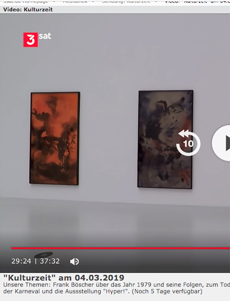
Yes, if you look at them as objects, you might call them some dioramas or showcases. But behind the glass, in the layers and reflections, there is also a lot of darkness and sometimes chaos that becomes visible. Viewers often associate them with landscapes that fluctuate between dystopia and utopia. This series has changed significantly over time. I started with a rather dark, monochrome color space, whose mood, in retrospect, sometimes reminds me of Lars von Trier’s films. They are now evolving into something much brighter, and I don’t yet know where it will lead me, or whether there will be an end to this series. At the moment they are temptingly “shiny”.
Which of Lars von Trier’s films are you referring to specifically?
Overall, Lars von Trier has definitely influenced me – even his older films. Of the more recent ones, I think Melancholia is great, in the truest sense of the word: in its drama, in its shimmering aura, in this overpowering mode. With Melancholia I was amazed by the fantastic pictures, for example, the two moons above the park. Everything vibrates with madness and decadence.
Neil Tennant says, “pop is surface.” That’s why pop has to be shiny.
With Tennant that has positive connotations, as it mainly does in pop. The cultural theorist Byung-Chul Han, on the other hand, sharply criticizes the glossy, smooth surface: “The smooth is the signature of our present”, is the first sentence of his book The Salvation of the Beautiful, and he does not mean that as an accolade. The other day I had a visitor from London in my studio, and although we barely knew each other, she spent a long time adjusting her hair in front of one of the acrylic paintings – because it was so reflective. Sure, the glossy, smooth surface has this narcissistic appeal. I am aware of that and it is a part of the thought space of these pictures.
How important is it for you to lock yourself away in the studio? What does the studio space mean to you? Do you step out of one world and move into another to devote yourself to your imagery?
Calm and distance are indeed important to me. It’s best to create a kind of utopia in the studio; a space with the greatest possible freedom. This is also a place where I have no obligations, no appointments, no financial worries. And I only use the Internet and telephone very selectively. The ideal studio state is one where I can remain undisturbed and think about things that seem essential, even existential. It is important for me to create these conditions in order to find my way into a good working process. In painting, concrete ideas are more like brakes, which in my case can actually cause serious blockages. So I try to systematically get into a state that enables free association. Then I get into the flow and find what I need, almost automatically. Yet in recent years I’ve also repeatedly realized projects where I had to do a lot of conceptual work. For the Kunsthalle Exnergasse in Vienna in 2016, I designed and curated an exhibition concept Antenna Futura with two friends and worked together on a project with a friend from Amsterdam who is an author, combining image, language and poetry. This work catapults me out of the studio utopia and requires a lot of communication and dealing with very concrete solutions and ideas. Painting, on the other hand, stands in opposition to that. For painting, as the author Michael Ende describes it, I have to “jump into another logic”.
Into a logic of childhood?
Perhaps. My recollection of that is vague. But in any case, it is different from our everyday logic, which is highly influenced by the principle of plan and execution. However, my childhood certainly plays a big role regarding my strong sense of the previously mentioned coexistence of beauty and menace, which can also often be found in my pictures. I grew up in a kind dropout family in the former GDR. My parents are anthroposophists who ran a guesthouse on a lake, which was also where we lived. That was absolutely not in keeping with the common ideology, so it was dangerous. The fundamental mood of my childhood moved between idyll and danger, so perhaps that’s a source. My mother was very enthusiastic about literature and often got illegal books for us from the West…
What kind of illegal books were they?
I was still a child, so they were children’s books.
Forbidden children’s books?!
Let’s just say: not appreciated. Michael Ende’s Momo was for- bidden, at least for a while. Which is strange, since one can clearly read it as being critical of capitalism. Selma Lagerlöf, if I remember correctly, was also viewed critically, as were Lewis Carroll and Astrid Lindgren. I mean, Pippi Longstocking, after all, is a kind of well-off anarchist, funded by a suitcase full of gold coins – that certainly did not fit in with the prevailing ideology. I had to hide some of those books when certain people came to our home, and I was not allowed to say certain things at school. So these books had a taboo quality and became even more attractive to me. That surely reinforced something in me, the feeling that art, literature and fiction have a subversive power. They develop a socially relevant power because they defy the status quo.
How old were you when the wall came down in 1989?
Ten.
Which books have accompanied you later in life?
I read a lot of books, often in parallel, so it’s hard to emphasize anything. At the moment I’m reading Christian Kracht’s Imperium. The book tells a story from the reform and eco-movement in the early 20th century. The protagonist, who really existed, is a guy who buys an island and decides to live only on coconuts. Both the language as well as the story itself have a sort of old fashioned, mannerist quality, yet something totally contemporary at the same time. The story surely also touched me so much because it tells of a dropout scene, like that from which I myself come from and whose concerns are now part of the mainstream.
Does it surprise you that quite a few viewers of your paintings seem to recognize images of the apocalypse?
No. In many there is a great drama and a shock.
A figurative aspect can often be recognized in your abstractions. The fractal of the disaster becomes concrete – if only in the mind of the beholder.
Possibly. We are always looking for meaning and, in pictures, always for a memory of something we know, with which we can relate it.
Every painter is faced with a line of tradition that begins with cave painting, leads through Goya and Picasso, and by no means comes to an end with Frankenthaler and Lassnig. As a painter in 2018, how do you feel about this history, this tradition and this ancestry? Even if you use different tools and materials than a stretcher frame, canvas, primer and paint in your glass paintings.
I have no fear of contact. There are different approaches, ranging from fighting, repelling and destroying to embracing, accepting and reaching out. I want to be able to use everything. I still see a lot of possible variations in the series I have started, which could lead to many more paintings. Becoming increasingly important is the dimension of music – as a further context alongside film, nature and literature.
How can one imagine the immateriality of music in your painting?
The starting points are the soundtracks or scores to selected science fiction films that stay with me, that have settled in my head as phantom melodies. These are the scores of Eduard Artemyev, for example to Solaris by Andrei Tarkovsky, as well as the scores of Vangelis and Hans Zimmer, who wrote the music for the two Blade Runner films. I’m fascinated by the soundtracks to the classic Star Wars films. Here, the composer John Williams has copied Richard Wagner’s principle of the leitmotif and transferred to his protagonists – of the intimidating imperial music in the case of Darth Vader on the euphoric-idealistic music with Luke Skywalker to the romantic fairytale music for Princess Leia. At the moment, in the studio I often listen to the wonderfully spherical soundtrack to Ghost in the Shell and I think it’s flowing into my current works. It almost automatically offers up color and form worlds.
For Carsten Nicolai aka Alva Noto, Artemyev’s music to Solaris was not enough. He composed his own electronic score.
In any case, music is a completely new and yet at the same time very familiar field that attracts me. You can not illustrate music – I find that extremely alluring. It goes straight to the heart and you don’t need language to understand it. So I can well imagine a kind of painting that tries to translate that emotionality into pictures. The immateriality of music makes it possible to work situationally and intuitively – and these are the cornerstones of my way of painting. ~
STRRR is the future of horizon-expanding television. Where superstars and brilliant newcomers hailing from the world of music, art, design, film, and fashion present their favorite clips and films through the nearly unlimited archives of the Internet. Each meticulously crafted episode presents a self-portrait of the selector, which allows us new insight into their life and work.
„Bettina Scholz is a painter and sculptor who fuses motifs from science-fiction novels with elements of Gothic paintings in her complex acrylic glass works. Today she shares Fran Lebowitz speaking on homosexuality, making a scene with Cate Blanchett and more.“
Watch now:
DIE IDEE DES POOLS IST DIE WEITE
(please scroll down for english version)
Die Ausstellung von Sid Gastl und Bettina Scholz ist ein beabsichtigter Clash, ein inszenierter Aufprall zwischen zwei scheinbar völlig unterschiedlichen Bildwelten. Trotz der offensichtlichen Unterschiede zwischen abstrakt-amorphen und konkret- gegenständlichen Bildern, gibt es Parallelen, die vor allem in den besonderen atmosphärischen Verdichtungen zu finden sind. Beide Künstler arbeiten an einem Hervorbringen von Welt, das die geistig-fiktive Dimension des Daseins in die Welt der Dinge und Materien zu gießen sucht und umgekehrt. In der Philosophie wurden, angefangen von Platon bis hin zu Descartes und Hegel, immer wieder Versuche unternommen das Verhältnis von innerer Wirklichkeit und äußerer Wirklichkeit durch Ideenlehren zu definieren. Die Vorstellung, die sich der Geist von den Dingen der Welt macht, ist auch der Grundstoff für die Bildproduktion von Sid Gastl und Bettina Scholz.
Die Idee des Himmels ist die Transzendenz, die Idee des Raumschiffes ist die Idee des Aussteigens und der Suche nach Erkenntnis, Die Idee des Waldes ist Undurchdringlichkeit und Hermetik., die Idee des Meeres ein unbezwingbarer, formverneinender Sehnsuchtsort.
Die Auseinandersetzung mit diesen Ideen ist bei beiden Künstlern der Formfindung vorgelagert. Die Bilder von Bettina Scholz bewegen sich dabei immer zwischen den Polen Schönheit und Bedrohung, die sie als Grundidee des Lebens an sich voraussetzt. Durch das Zusammenschütten und Zusammenführen von uralten und ganz neuen Elementen findet sie Formeln für reale und imaginierte Vorstellungen von Welt und macht visuell große zeitliche Sprünge: Ihr Interesse für Sakrales und Banales, für gotische Malerei, aber auch für Science Fiction flackert in den Tiefen der geschichteten Glasbilder auf. Diese Bilder gleichen einer Selbstreflexion unseres Geistes über seine Wahrnehmungen, Empfindungen und Ordnungssysteme und bleiben dabei ungehorsam gegenüber eindeutigen Metaphern und Übersetzungen. Die ruhelose Eigendynamik ihrer Weltgenerierung, führt bisweilen zu überbordenden, barock-opulenten Formereignissen, wenn sich materielle Dinglichkeit aus dem Schlamm der Möglichkeiten herausbildet.
Der Ansatz und auch die Herangehensweise von Sid Gastl und Bettina Scholz unterscheiden sich stark, gleichzeitig jedoch gibt es eine Ähnlichkeit, was die suggestive Wirkung der Bilder betrifft. Gastl akzeptiert zwar die äußere Erscheinung der Dinge in ihren Grundkoordinaten, setzt aber die Welt, aus einer Vorstellung heraus, neu zusammen. Eine wesentliche Bedeutung kommt hier dem Licht zu. Jedes Bild hat ein starkes, einzigartiges Licht, das scheint als wäre es nur in diesem Moment sichtbar für ein paar Sekunden. Gleichzeitig ist es im Bild wie ewig festgehalten, als wäre es kein physikalisches Phänomen sondern ein grundsätzlicher Seinszustand. So geht es, etwa bei den Waldbildern, um eine Vorstellung von Dinglichkeit, die unser seelisches wie assoziatives Spektrum, auf die Welt der Dinge und Erscheinungen anwendet, um so neue Konstellationen zu generieren, die unser inneres Bild von der äußeren Welt in Rotation versetzen. Tradierte Klischees die der Begriff Wald aufruft, greifen hier nicht. Die Bilder von Interieurs, die sich über große Fenster weit nach außen öffnen, verhandeln eine unauflösbare Gleichzeitigkeit von Innenraum und Außenraum. Die Differenzen fallen zusammen und bilden etwas neues, komprimiertes und hochemotionales.
Sid Gastl und Bettina Scholz reizen die Möglichkeiten der Dramatik und Verdichtung aus und setzen einen Prozess der Umwandlung und Veränderung in Gang. Durch den erweiterten Kunstbegriff und die formale Radikalität der Moderne geriet in Bezug auf die Malerei etwas in Vergessenheit, was man als den Urgrund der menschlichen Bildproduktion begreifen könnte. Malerei ist in der Lage, etwas zu geben, was wir auf der geistig-existenziellen Ebene zum Verarbeiten der Welt benutzen können. Sie entwickelt eine, mit anderen Medien und Methoden nur schwer vergleichbare visuelle Sprache, welche die immer wieder unbegreifliche Differenz zwischen der faktisch, materiellen Dingwelt und der Idee von Dingen – im Sinne eines geistigen Universums – sowohl beschreiben als auch auflösen kann. Diese Synergie liegt im Wesen der Malerei, weil sie im Kern beides ist. Ihre Wirkung liegt in ebenso hohem Maße im Materiellen wie auch im Geistigen.
THE IDEA OF THE POOL IS VASTNESS
The exhibition featuring Sid Gastl and Bettina Scholz is very much a deliberate clash or staged impact between two seemingly divergent visual worlds. Despite obvious differences and contradictions between the artists‘ abstract-amorphous and concrete-representational paintings, there are also strong parallels to be found, particularly in the oddly atmospheric condensation of the two poles. Both artists work towards generating or manufacturing a space, a world even, in which the ghostly fictitious dimension of being is poured into the world of matter and things, and vice versa. Starting with Plato and spanning to Descartes and Hegel, philosophy has sought to define the relationship between inner and external reality via ideology. How the spirit might imagine the things of this world – this is the base element that helps fuel both Sid Gastl’s and Bettina Scholz’s image production.
The idea of heaven is transcendence; the idea of the spaceship is the idea of opting out and the search for illumination; the idea of the forest is impenetrability and hermeticism; the idea of the ocean is a shape-shifting, indomitable place we long for.
Examining these ideas is integral to the form-finding process for both artists. In doing so, Bettina Scholz creates works that hover somewhere between beauty and threat, two extremes she sees as being part of the primeval idea of life itself. By mixing and merging ancient and new elements, Bettina Scholz finds formulas for real as well as imagined notions of the world, leaping far and wide through history with her visual approach. Flickering in the depths of her layered glass paintings we might catch glimpses of her love for the sacral and banal, for Gothic painting, for science fiction. These paintings are not unlike the self-reflections of our own spirit, contemplating perceptions, sensations and classification systems, all the while refusing to align with obvious metaphors or translations. Their worlds come into being through a perpetual, indefatigable momentum which occasionally results in baroquely opulent forms – concrete materiality rising from the muddy waters of possibility. Though their starting points and artistic approaches are quite different, Sid Gastl’s and Bettina Scholz’s works produce a similarly suggestive effect. While Gastl accepts the outwardly appearance of things without changing their elemental coordinates, he reconfigures the world in which they might appear. In this world – which stems from a moment of imagination – light plays a particularly important role. Every painting has its own, powerful light, visible only, so it seems, for but a moment. And yet there it is, captured (or caught?) forever within the painting, as though it were not a physical phenomenon but a fundamental state of being. The forest paintings, for instance, speak of an idea of materiality that applies both our associationist spectrum and the spectrum of the soul to the world of things and appearances, thus creating new constellations that displace the rotation of our internal image of the external world. More traditional clichés associated with (the idea of) the forest find no footing here. Paintings of interiors, opening out into the vastness beyond via large windows, present an inextricable simultaneity of inside and outside. Differences implode, forming something new, compressed, richly emotional.
Sid Gastl and Bettina Scholz explore the possibilities provided by all that is dramatic, all that is condensed, thus setting a process of transformation and reorganisation into gear. With Modernism’s formal radicalism and wider definition of art, the primeval motivation for human image production (or what some might consider this as being) fell somewhat into obscurity. Painting can give us something that we may then apply to help us process the world on an existential level. It develops a visual language that is not readily comparable with other media or methods, one that both describes and dissolves the unfathomable difference between the factual, material world of things and the idea of things. This synergy pulses through painting, because painting, in its core, is both at once. The effect generated by painting is therefor also in equal parts material and immaterial, intangible, spiritual.

Bettina Scholz& Nik Nowak: HALL
Kunstverein Schwäbisch Hall, 2016/2017
(english version below)
Bettina Scholz und Nik Nowak eröffnen in ihren Arbeiten visuell bzw. akustisch Szenarien von großer fiktionaler und sinnlicher Intensität. Die Ausstellung im Kunstverein ist ihre erste gemeinsame Ausstellung, jedoch keine Vorführung gemeinschaftlicher Arbeit, sondern ein Aufeinandertreffen und Interagieren beider Werke. In der Wahl ihrer künstlerischen Medien sind sie gleichermaßen eigen. Bettina Scholz konfrontiert uns in ihren screenhaften Glasbildern mit atmosphärischen Kraftfeldern, die einen filmischen Sog entwickeln. Nik Nowaks Soundinstallationen wie seine futuristischen Roboter-Drohnen greifen auf beunruhigend physisch empfundene und ambivalente Weise Technologien auf, die alltägliche aber auch militärische Assoziationen wecken.
In their works, Bettina Scholz and Nik Nowak present visual and acoustic scenarios – respectively – that are rich in fictional and sensory intensity. In this, their first joint exhibition, the spotlight is very much shone on the encounter and interaction of both artistic oeuvres, rather than featuring collaborative works. Both artists share an idiosyncratic approach when it comes to selecting media. Bettina Scholz’s screen-like glass paintings confront the viewer with atmospheric force fields exerting an oddly cinematic pull. Nik Nowak’s sound installations as well as his futuristic drones play on technologies in a way that is both disconcertingly physical and ambivalent, stirring up associations to the mundane but also the military.
Bettina Scholz, *1979; Nik Nowak, *1981, both live in Berlin.
CV
-
-
lives in Berlin/Germany
-
-
E d u c a t i o n
-
Meisterschülerin (post-graduated MFA) class of Antje Majewski
-
Diploma in Fine Arts, Kunsthochschule Berlin Weissensee, Germany
-
Chelsea College of Arts, London, UK
-
Fine Arts / Painting Kunsthochschule Berlin Weissensee
-
-
G r a n t s a n d A w a r d s
-
Nominated for Konrad-von-Soest-Preis, LWL-Museum für Kunst und Kultur, Münster, DE
-
Nominated for Kunstpreis Kunsthalle Lingen, Lingen, DE
-
Exhibition grant Kunsthalle Exnergasse Vienna, Austria
Reisestipendium, Berliner Senat, Berlin Senate Cultural Affairs Department, DE
-
Longlist, Großer-Hans-Purrmann-Preis, Speyer, DE
-
Nominated for Eb-Dietzsch-Art Price, Gera, Germany
-
-
P u b l i c a t i o n s
-
Bettina Scholz – OST/WEST und das südliche Orakel, Snoeck Verlag, Cologne, DE
-
Bettina Scholz – Drift, exhibition catalogue SETAREH, Dusseldorf
-
Bettina Scholz – Intro Extro New Moon Love Song, artist book, Santa Lucia Galerie der Gespräche, Berlin
-
Bettina Scholz – video, Monograph, layout and Design by Fuchs Borst, MMKoehn Verlag, Berlin/Leipzig
-
Berlin. Status 2, catalogue to accompany the group exhibition at Kuenstlerhaus Bethanien, Berlin
-
Bettina Scholz 20×15×3,5, catalogue to accompany the exhibition at Galerie M+R Fricke, Berlin
Split Pieces, Booklet, edited by André Fuchs and Bettina Scholz
-
-
T e a c h i n g
-
Professor of Painting and Drawing, Alanus Hochschule, Alfter b. Bonn/ Mannheim
-
Lectureship for Painting, Goethe-Universität, Frankfurt/Main
-
Lecturer (Drawing), Udk/University of Arts, Berlin
-
-
S o l o ( S ) a n d G r o u p e x h i b i t i o n s
-
Unding und Urding (S) mit Jochen Plogsties, Künstlerhaus Göttingen, DE
Jott Hoch 2, Schau Fenster – Art Space, Berlin, DE
I Am Not My Body, Künstlerhaus Dortmund, DE
OST/WEST und das südliche Orakel (S), Kunstverein Heilbronn, DE
-
OST/WEST (S), Emsdettener Kunstverein, Emsdetten, DE
Industry, Uferstudios Berlin, DE
OI/Arbeiten an der Schwingtür, Schau Fenster – Art Space, Berlin, DE
Exterritoriale Situation 95, Schau Fenster – Art Space, Berlin, DE
-
Lage der Fiktion: Mary Shelley und das rote Bild (S), Santa Lucia Galerie der Gespraeche, Berlin, DE
TRYST art fair, TAM Torrance Art Museum, Torrance, US
Die Luecke, die der Fehler laesst, Uferhallen Berlin, DE
YOU WANT IT DARKER – Songs About the Approach of Death, Museum Friedhof Forum, Zurich, CH
Idiosynkrasien, Roam, Berlin, DE
I’m not there. The invisible influx of music on art, Zidoun Bossuyt Gallery, Luxembourg, LUX
Alptraum – wandering exhibition, Polarraum, Hamburg, DE
-
The truth ain’t waterproof, Kunstpunkt Galerie für aktuelle Kunst, Berlin, DE
On Equal Terms, Uferhallen Berlin, DE
4 Jahre Kanya & Kage, KanyaKage, Berlin, DE
Zeitregen (mit Jochen Plogsties) (S), Kunstverein Bamberg, DE
-
What can I offer you today?, a one-to-one performance, Studio Rosiris Garrido, Berlin, DE
Shining, Galerie Stephanie Kelly, Dresden, DE
Viele Stimmen (S), Kanya&Kage, Berlin, DE
-
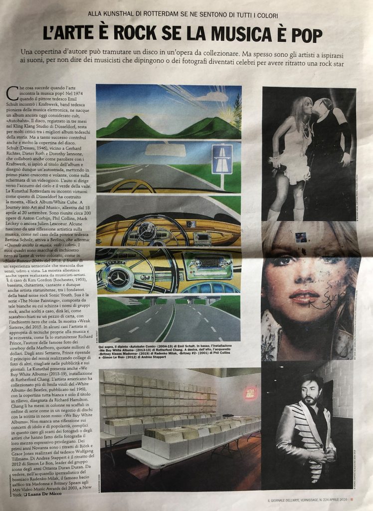
Black Album/White Cube, Kunsthal Rotterdam, NL
Gargoyle (S), Santa Lucia Galerie der Gespräche, Berlin, DE
Heaven and Earth in One Stroke, SETAREH, Düsseldorf, DE
2 Years Kanya&Kage, Kanya Kage, Berlin, DE
-
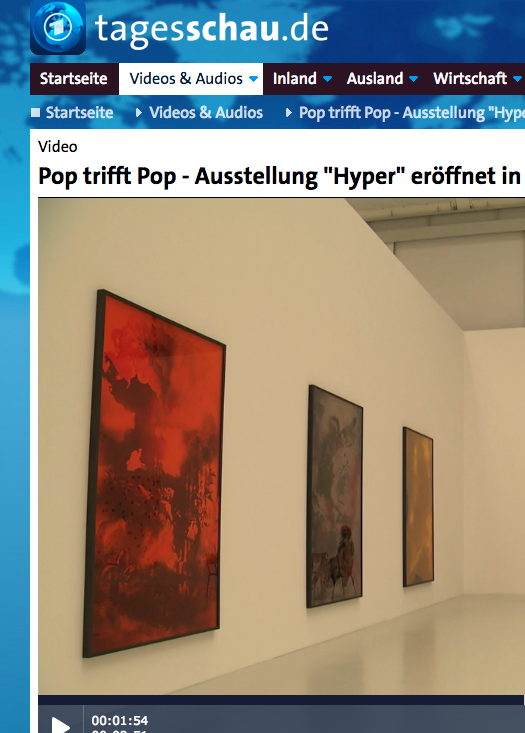
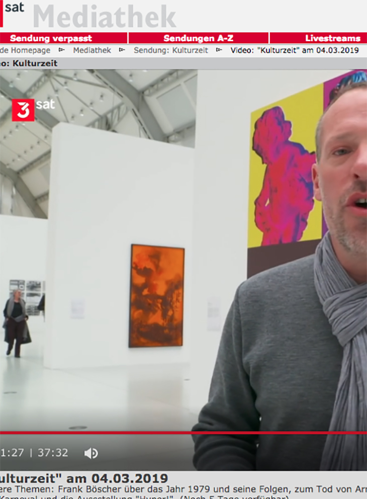
Hyper! A Journey Into Art and Music, Deichtorhallen, Hamburg, DE
Drift (S), SETAREH Galerie, Dusseldorf, DE
Milchstrassenverkehrsordnung –Space is the place, Künstlerhaus Bethanien, Berlin, DE
From The Rocket To The Moon, Parrotta Contemporary, Cologne/Bonn, DE
Jahresgaben/Editionen, Kestnergesellschaft, Hannover, DE
Ein Monument für Wolgang Neuss, Studiogalerie Haus am Lützowplatz, Berlin, DE
Beautiful Desasters, (S) Salon Alexander Ochs Private, Berlin, DE
Alptraum, touring exhibition, La Estacion Gallery, Chihuahua, MX
-
Parallel Realities (S), Tony Wuethrich Galerie, Basel, CH
Intro Extro New Moon Love Song (S), Santa Lucia Gallery, Berlin, DE
Salon der Gegenwart, Hamburg, DE
Wer hat Angst vor Schwarz Rot Gold?, Alexander Ochs Private, Berlin, DE
OneHundredOne 2, Tony Wuethrich Galerie, Basel, CH
-
OneHundredAndOne, Tony Wuethrich Galerie, Basel, Switzerland
Wir nennen es Arbeit, Opere Scelte Galleria, Turin, IT
InterWalls, Galerie Tony Wuethrich, Basel, CH
-
Antenna Futura (S), Kunsthalle Exnergasse, Vienna, AT (curatorial project)
Hall (S), Kunstverein Schwäbisch Hall, DE
Die Idee des Pools ist das Weite (S), Rathausgalerie-Kunsthalle, Munich, DE
-
Alptraum-touring exhibition, Salon de Lirio, Goa, IN
Dinge, die passieren und nicht passieren, Alexander Ochs Private, Berlin, DE
Alptraum-touring exhibition, Visual Voice Gallery, Montreal, CA
-
Book Launch video (S), Uferhallen, Berlin, DE
Imaginäre Größe oder Der Anfang von Etwas (S), SchauFenster, Raum für Kunst, Berlin, DE
Good taste – hopefully, Alexander Ochs Showroom, Berlin, DE
Alptraum, touring exhibition, UGM Maribor Art Gallery, Maribor, SI
Present, Kunstraum Kreuzberg, Berlin, DE
The Artist as Curator`s Art Vol. IV, Schau Fenster, Berlin, DE
-
Berlin. Status 2, Kuenstlerhaus Bethanien, Berlin (catalogue), DE
Die Heimsuchung, Galerie Hartwich, Sellin, Rügen, DE
Alptraum/Pophits, ArtSpace Rhein Main, Offenbach, DE
Objects of my affection, Galerie M+R Fricke, Berlin, DE
-
20 × 15 × 3,5 (S), Galerie M+R Fricke, Berlin, DE (catalogue)
Ballungsraum, Bar Babette, Berlin, DE
Alptraum, Green Papaya Art Project, Metropolitan Museum of Manila, PH
Montage, Schau Fenster – Raum für Kunst, Berlin, DE
-
Spirits, (S) Stattbad Wedding, Berlin, DE
Der Hammer (art auction&performance), Cashama Gallery Manhattan, New York, US
-
Credits
© Bettina Scholz 2025. All rights reserved. Website by Fuchs Borst.